Machine Learning has been on my tech radar for a while. I spent a few amazing days at Microsoft’s Ignite Tour in London this year, mainly attending the Azure AI / ML sessions;
AIML10, AIML20, AIML30, AIML40 and AIML50.
A few weeks later I teamed up with Paul Thomas and Equdos, at Microsoft’s AI Cloud Hack. We came up with the idea of using Azure’s ML Studio to build a model to predict heart disease. The use case was loosely based on a presentation I’d given earlier in the month on decision making theory and decision trees (see slides 12 & 13). We won the hack, although we didn’t manage to get everything working perfectly! I thought I’d come back to it later and write a blog post about it…
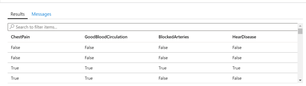
We only had 3-4 hours of hacking time, so I made up a heart disease data set, based on three features: chest pain, blood circulation and blocked arteries. I put a quick table together in SQL Azure with some pseudo-randomised data. Each row represents one patient, whether they have chest pain, good blood circulation, blocked arteries and finally whether they have heart disease.
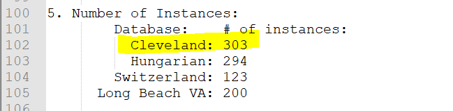
I came back to this today, to see if I could find some better data. A bit of Googling later, I came across UC Irvine ICS’s ML Repository Heart Disease Data Set [1]. Bingo!
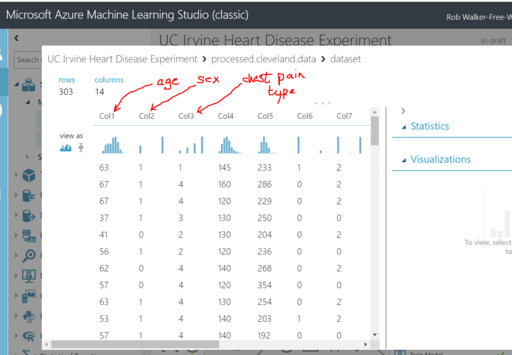
The features of this data set are more extensive and based on real (anonymised) patient data. This file gives an overview of the data set. I ended up using the processed Cleveland set as it had the largest number of instances.
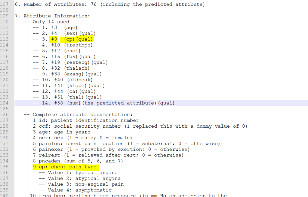
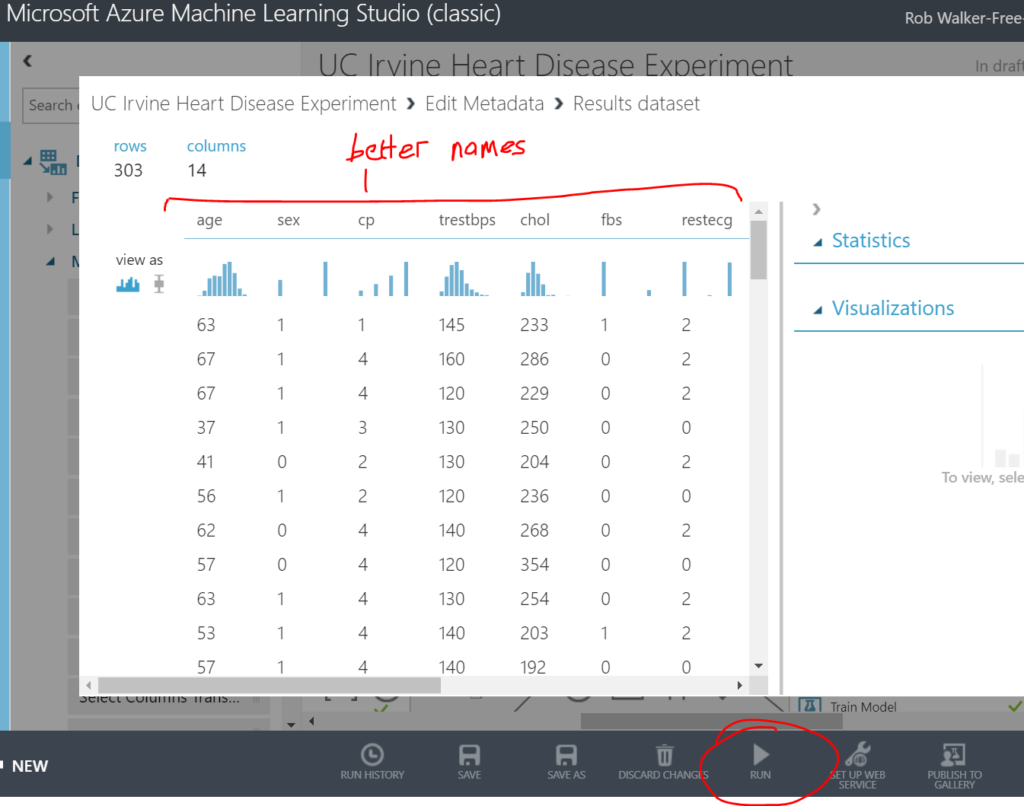
There are 13 “features” of the data set which can be used to predict heart disease, and a 14th feature which is the predicted outcome (i.e. if the patient has heart disease). See the notes below. The 14 features (columns) are a subset (see lines 110-124 in the screenshot below) of the full data set, which is described from line 126 onward. For example column 3. (line 113) relates to column #9 in the original / full data set (line 135). The first parenthesised value below is a short hand for the feature / attribute name, for example (cp) relates to chest pain. I added the second parenthesised values myself to help later on. It relates to whether the attribute is qualitative / categorical. For example, sex can be use to categorise patients into female and male, whereas resting blood pressure cannot as it holds a wide range of numeric values.
Azure Machine Learning Studio is a cloud tool that can be used to build and train machine learning models. In short, it can take a data set as an input and along with some configuration, can output a “model” which can be queried to make a prediction. In my case, I want to input a new patients details – age, sex, chest pain, resting blood pressure, … etc AND have the model output (predict) whether the patient has heart disease. In this blog post I’ll take you through the steps I used to build, train, score and evaluate the model. In a follow up blog post I’ll wrap the model up in a web service which can be called to predict heart disease.
There are two versions of the Azure ML Studio – a new version and an old version. Although the new version is easier to use, I’ve become familiar with the old version. I’ll follow up with another blog post to show how to repeat this exercise with the new version.
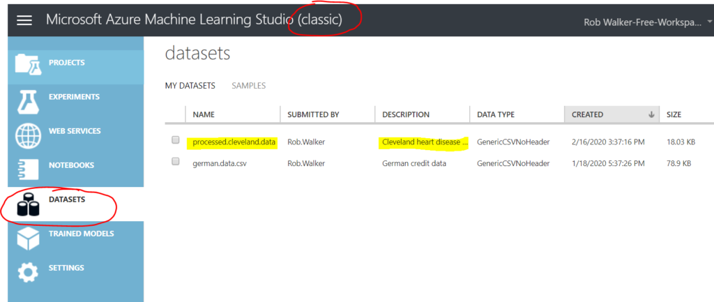
The first step is to upload the data set. In this example I simply uploaded the Cleveland data set file to ML Studio’s data set area. You can also pull in data sets from other sources.
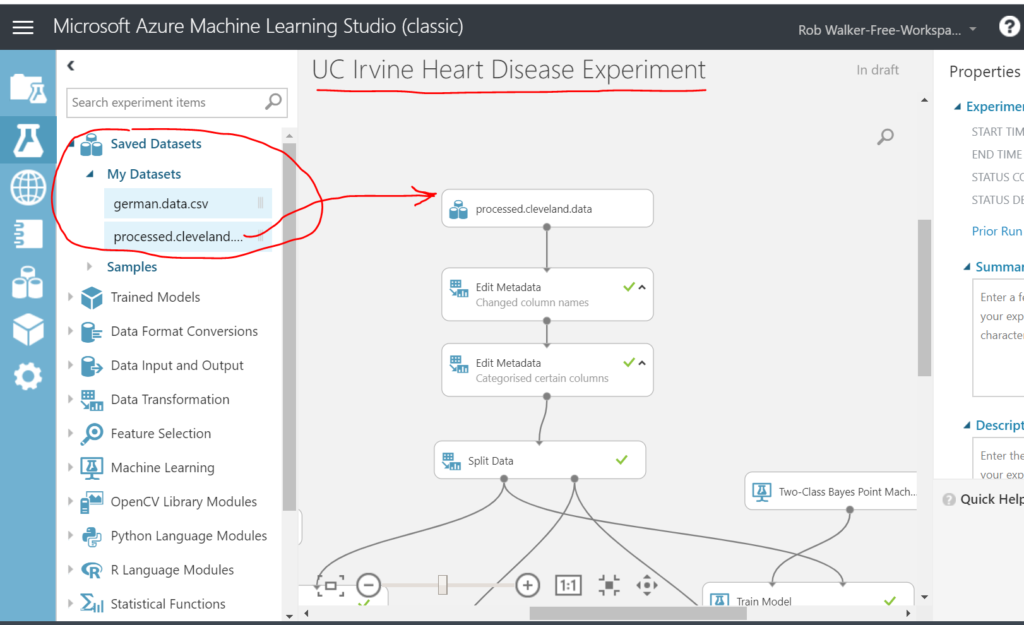
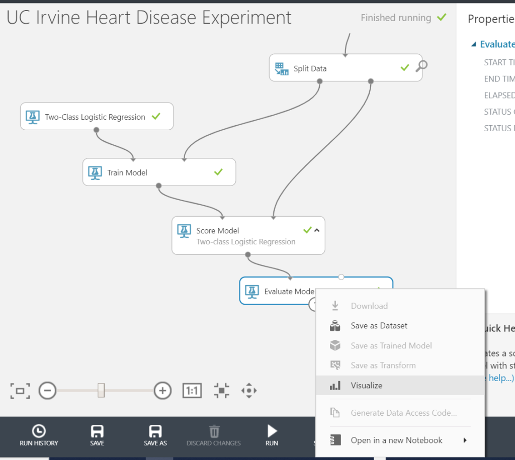
Second step is to create an experiment. Name the experiment up at the top and then drag and drop the data set into the top of the design surface.
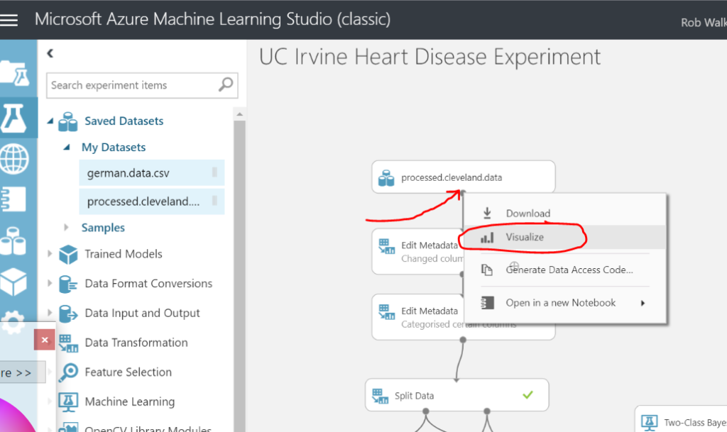
Clicking on the dot at the bottom of the data set step allows you to visualise the data.
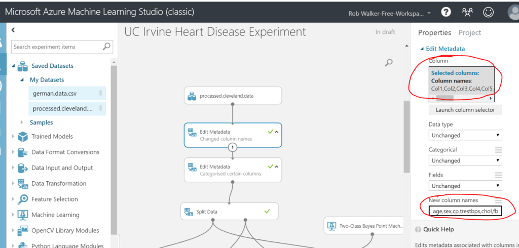
Next I dragged on an “edit metadata” step (data transformation > manipulation > edit metadata) in order to add some friendly column names. Just drag the output of the data set step (the dot at the bottom of the step) to the input of the new edit metadata step (this will draw an arrow between the two steps). Be careful here not to include spaces in the column names, as this can cause issues later. When you’ve completed each step you need to run the experiment in order to view the result. The green tick in the step denotes that the step has been ran.
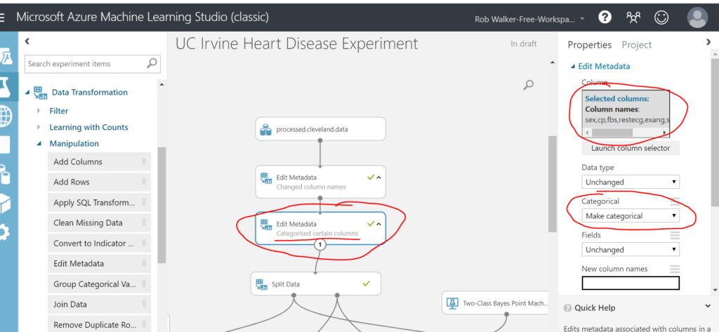
Then I added another edit metadata step to categorise the qualitative columns.
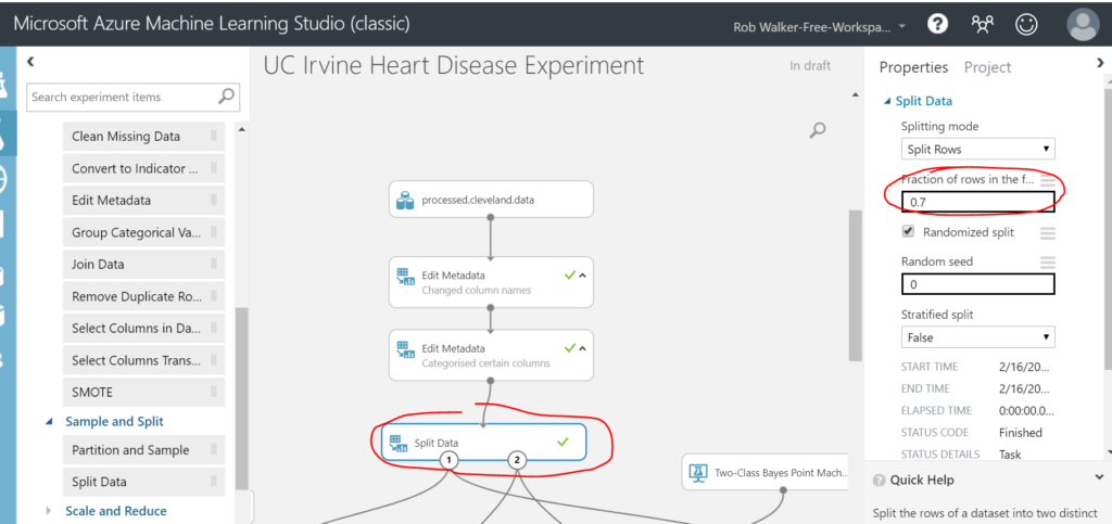
Once complete, it’s time to split the data. I’m going to send 70% of the rows to train the model, reserving 30% of the data to test the results of the trained model. To do this, drag a Data Transformation > Sample and Split > Split Data step. Connect it up and configure a 70% split.
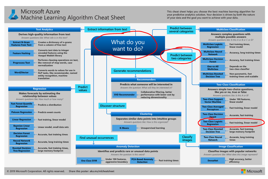
Next job is to select a machine learning algorithm. Microsoft have published a cheat sheet to help with this. In the new version of ML Studio this is even easier as the Studio suggests the best algorithm for you, based on your data and use case! Using the cheat sheet approach, the best fit is a two-class logistic regression. Hence, select the corresponding model step from Machine Learning > Initialize Model > Classification > Two-class Logistic Regression.
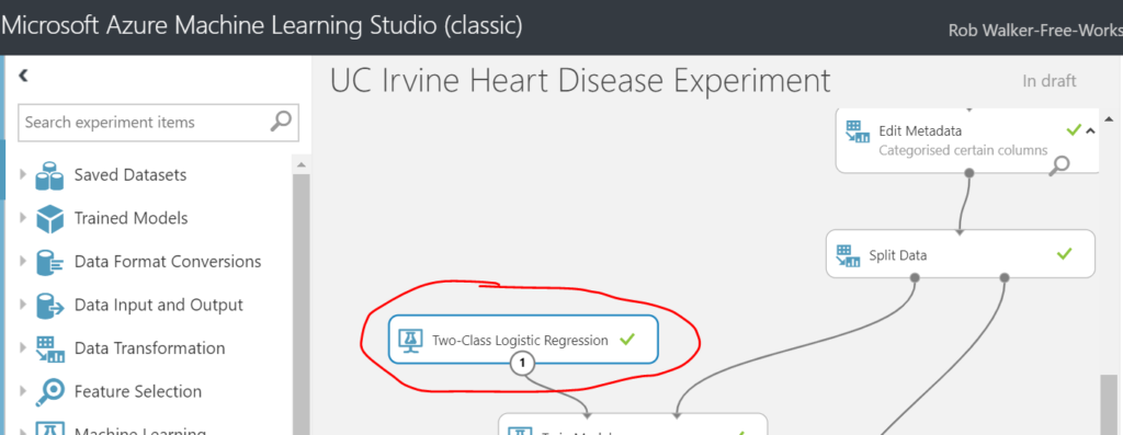
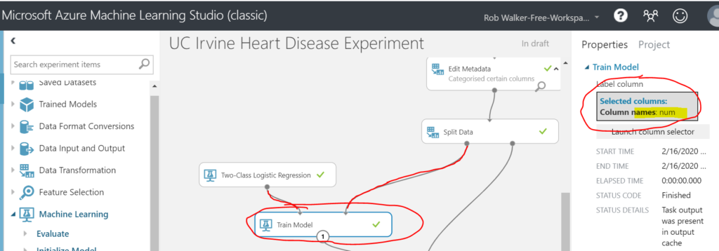
Next add a Machine Learning > Train > Train Model step. Connect the Two-Class Logistic Regression as an input on the left and the left hand (70%) split output form the previous split data step. Select the num column as the attribute to be predicted (i.e. the attribute which denotes whether the patient has heart disease).
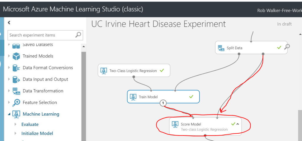
Next add on a Machine Learning > Score > Score Model step. Connect the result of the train model step as an input on the top left and the remaining 30% of the split data as an input on the top right.
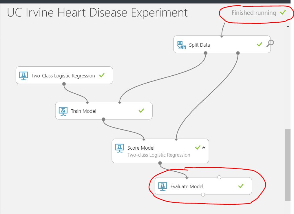
Finally, add a Machine Learning > Evaluate > Evaluate Model step. Connect the output of the previous score model step as an input on the top left hand side of the new evaluate model step. Note: it’s possible to evaluate / compare another model (algorithm) by feeding it’s result into the right hand side of the evaluation step (I’ve left that out for now). Once that’s all connected, run the entire experiment and you should see a green tick on each step.
As previously, to visualise the result of the evaluation, click on the dot at to bottom (output) of the evaluate model step, and select visualise.
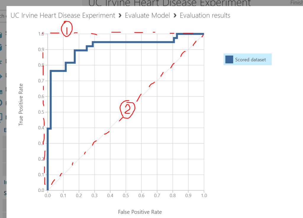
The receiver operating curve shown on the graph shows the accuracy of the model (blue series). A perfect model would follow the line I’ve drawn in red dots and marked as (1) – i.e. always have a true positive rate of 1.0 and a false positive rate of 0.0. The second 45 degree dotted line I’ve drawn (2) is representative of randomly guessing (e.g. flipping a coin). Our scored data series has therefore performed well.
Scrolling down the evaluation a bit further reveals more details. The four numbers at the top left (A) represent the classic confusion matrix. At the top left, the number of instances of heart disease that were predicted correctly (high number is good). Bottom right is the number of instances where there was not heart disease and this was predicted correctly (high number is good). At the bottom left is the number of instances the model predicted no heart disease incorrectly (low number good) and the top right is the number of instances the model predicted no heart disease incorrectly (low number good). The four number of the top right (B) show the metrics of the model’s accuracy.
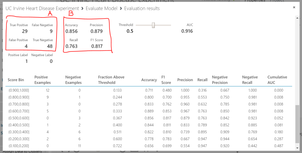
In summary, the model’s looking good. In the next post I’ll show how the model can be published and accessed via a web service. This will allow users to input their factors (features) associated with heart disease and receive a prediction from the machine learning model.
[1] Many thanks to the principal investigators responsible for the data collection at each institution;
- Hungarian Institute of Cardiology. Budapest: Andras Janosi, M.D.
- University Hospital, Zurich, Switzerland: William Steinbrunn, M.D.
- University Hospital, Basel, Switzerland: Matthias Pfisterer, M.D.
- V.A. Medical Center, Long Beach and Cleveland Clinic Foundation:
Robert Detrano, M.D., Ph.D.
Be First to Comment